
Stop guessing who is overloaded and who has room. Resource Hero’s capacity and utilization reports and dashboards give you instant visibility into resource allocation across your whole company: spot over-allocated resources before they burn out, surface available capacity you can put to work, and compare planned hours against what actually happened.
Start Here: Set Up Capacity
These reports are only as good as your capacity data. Before you can measure utilization, each resource needs Capacity records that define how many hours they are available to work. Capacity records support day-level precision and different schedules for different date ranges, so you can model part-time, seasonal, and flexible arrangements. For example, 8 hours a day January through June, then 10 hours a day Monday through Thursday over the summer.
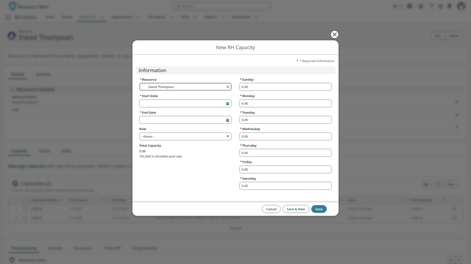
- Create capacity for your team on the Capacity tab of each resource. See The RH Capacity Object for step-by-step setup.
- Behind the scenes, each Capacity record stores its hours in the same data model as your forecasts and actuals. That is why every report and dashboard below stays accurate at any grouping, without changing a single formula.
The Reports
Resource Hero ships an RH Capacity / Utilization Reports folder with three ready-to-run summaries: by Resource, by Team, and by Role.
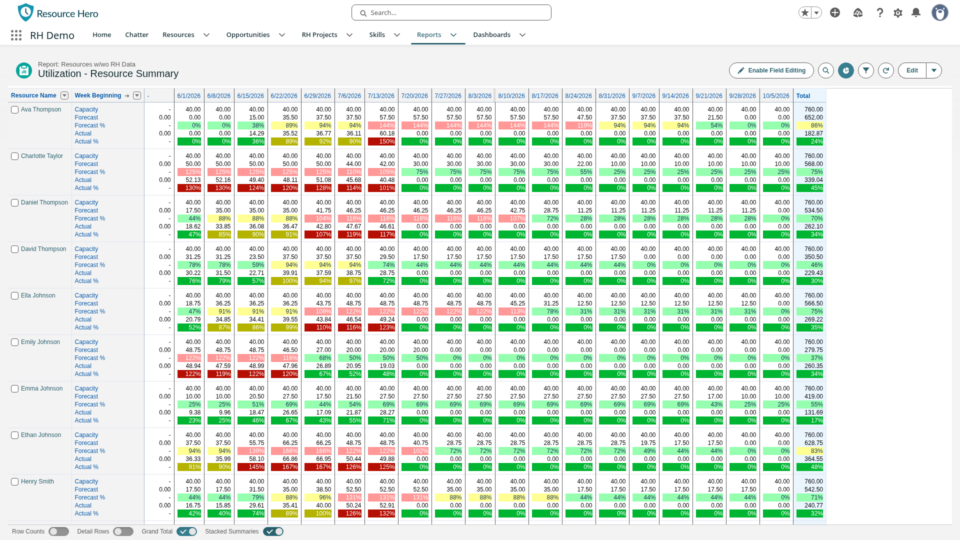
Each is grouped by the Week Beginning field (Monday by default) and calculates:
| Field | Type | Description |
|---|---|---|
| Capacity | Number | The total available working hours for the resource during the week, based on their capacity schedule. |
| Forecast | Number | The total planned hours for the resource across all projects, opportunities, PTO, and other activities during the week. |
| Forecast % | Percent | The percentage of available capacity that is planned to be used. |
| Actual | Number | The total actual hours worked by the resource across all projects, opportunities, PTO, and other activities. |
| Actual % | Percent | The percentage of available capacity that was actually used. |
Because capacity, forecast, and actuals live in one data model, you can regroup any of these reports by day, week, month, quarter, team, or role and the utilization math stays correct. There is no separate report and no rebuilt formula for each time period.
Read Utilization at a Glance
The summary reports are color-coded so over-allocation jumps out. Light colors show your forecast (planned); dark colors show your actuals (tracked).
Forecast % (light):
- Light Green: 0 to 80 percent (under-allocated, capacity to spare)
- Light Yellow: 80 to 100 percent (well-allocated)
- Light Red: over 100 percent (over-allocated)
Actual % (dark):
- Dark Green: 0 to 80 percent (under-utilized)
- Dark Yellow: 80 to 100 percent (well-utilized)
- Dark Red: over 100 percent (over-utilized)
Three Dashboards, One Complete Picture
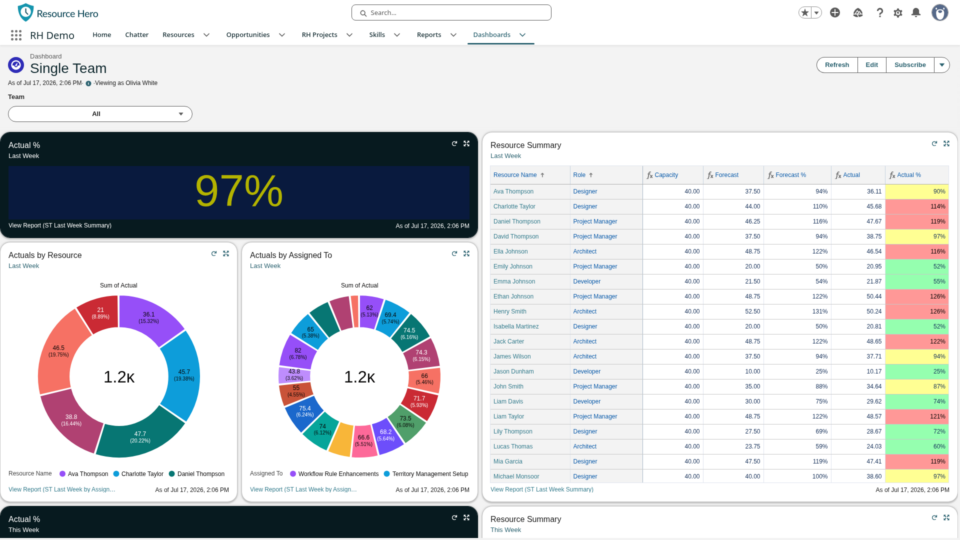
Resource Hero includes three dashboards so every stakeholder sees the right altitude of the same data.
For individuals, My Resource Hero: tailored to the logged-in resource, showing their tracked and forecasted utilization for last week, this week, and next week, plus where their hours are going.

For team leaders, Single Team: focuses on one team, with utilization trends week to week and year to date, plus detailed breakdowns at the individual team member level.
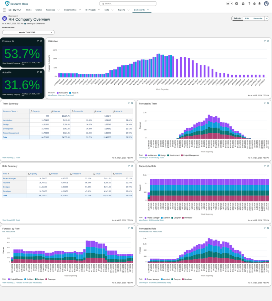
For executives, Company Overview: a high-level view of the whole organization, with forecast versus actual utilization across all teams and roles, and drill-down by team and by role.
Get Started
- Create your Capacity records on the Capacity tab of each resource: The RH Capacity Object.
- Open the RH Capacity / Utilization Reports folder and run the Resource, Team, or Role summary.
- Add the three dashboards (My Resource Hero, Single Team, Company Overview) from the Resource Hero dashboards folder.
- Build your own reports and dashboards on the same data model for your unique use cases: Gain Insights with Reports and Dashboards.

